
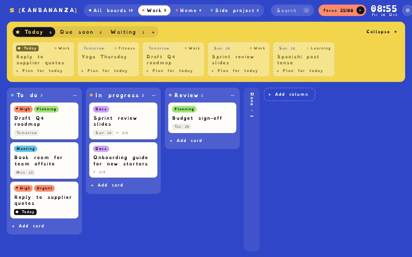
Reading a long list of small, tightly packed text takes effort, and that effort adds up across a day. KanBananza lets you change how everything looks, so your plan is easier to read. Everyone's different, so nothing is forced on: switch on what helps and leave the rest.
Fonts made for reading
- OpenDyslexic, a font designed for dyslexic readers, on every card, label and button.
- Atkinson Hyperlegible, designed for low vision, with very distinct letter shapes.
- Wider spacing between letters, words and lines.
Size and contrast
Text can go up to 150%, and high contrast mode adds solid backgrounds, stronger outlines and underlined links. Browser zoom works too.
Colour overlays
Many dyslexic readers find text easier on a tint. KanBananza has nine overlay colours, from cream and yellow to blue and green, at four strengths. You can try one on this page now with the Aa menu at the top.
Less to read in the first place
- Steps on the card: tap the ✓ count to see just the steps still to do.
- Labels and colours help you spot cards without reading every title.
- Quick add understands plain English: "Call Sam tomorrow 3pm #home" fills in the date and label for you.
Set up in one tap
When you install KanBananza, a short welcome offers Dyslexia-friendly as a single switch: the font and spacing together. Everything can be changed later under Settings, Accessibility. Read the full accessibility statement.
KanBananza is free for Chrome, Edge and Firefox. No account, no tracking, and every accessibility option included.
Add to Chrome, it's free