
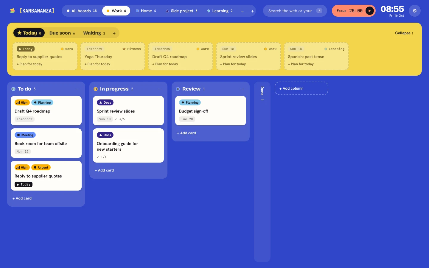
Kanban boards lean on colour: red for urgent, green for done, a colour for each project. If you're colour blind, those cues can blur together. KanBananza has a full colour blind mode, free, so the board still makes sense.
Safe palettes for each type
Pick your type and KanBananza swaps label, priority, board and column colours for a palette chosen to stay distinct for it:
- Red-green, green weak (deuteranopia, the most common type)
- Red-green, red weak (protanopia)
- Blue-yellow (tritanopia)
- No colour (achromatopsia)
The palettes were checked by simulating each type and measuring how far apart the colours land.
Colour is never the only clue
- Labels and boards get shapes.
- Priorities get bars, like a signal meter.
- Columns get stage icons for to do, doing, waiting and done.
- Tinted cards get patterns.
See what others see
Preview as shows the whole page the way each type of colour blindness sees it. Handy for checking your own colours, or for anyone choosing colours for someone else.
More in the accessibility statement.
KanBananza is free for Chrome, Edge and Firefox. No account, no tracking, and every accessibility option included.
Add to Chrome, it's free